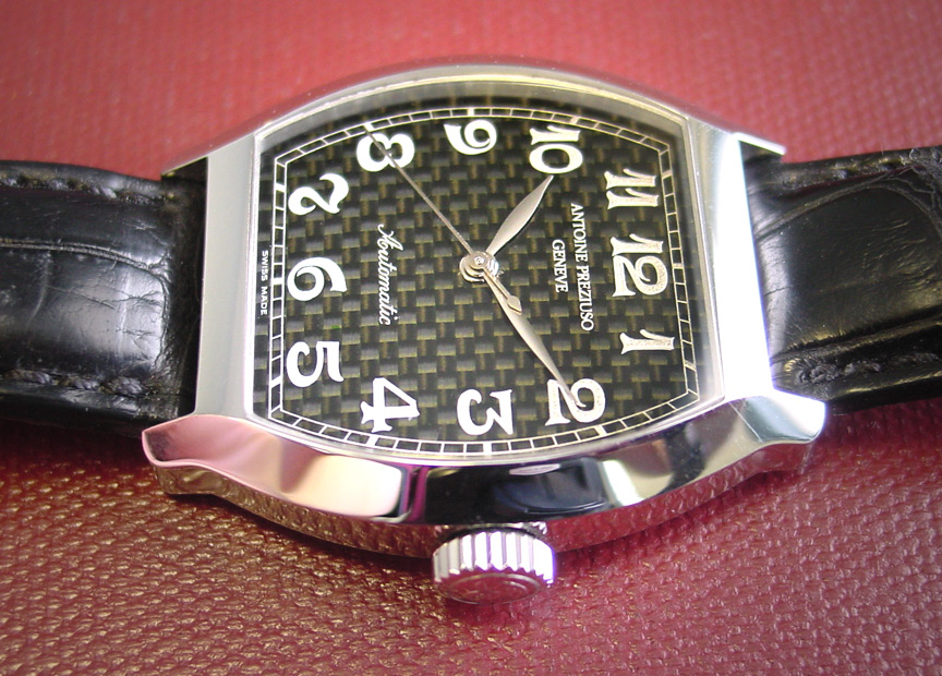
However, I was absolutely stunned at the beautiful effect he has created. The numerals and markings, which I believe are printed, appear to be floating in front of a sort of "hologram" of back and gray. The sense of depth is outstanding, as is the legibility.
The second picture is a grouping of 10 clips cropped from several photos taken of the dial. This will give you some idea of the variety of textures which this material can appear to take on. I should note that these are NOT fuzzy, over-enlarged clips -- they all come from pictures taken with a macro lens at a distance of perhaps 2 1/2 inches. The sense of motion that these suggest is also visible through the loupe, and one can detect 2 or even 3 distinct patterns at the same time (say, "stairstep", "waffle" and "square wave") with barely a movement of the wrist.

Third picture is of the back.
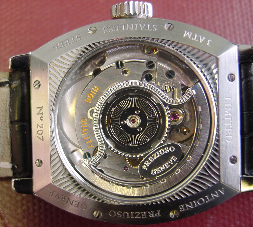
Too bad he forgot to install the tourbillon... Thanks for looking! Please check out the rest of my Watch Articles and Pics I hope you enjoyed this!
SteveG
steve@ninanet.net
All content Copyright asserted 2003